Email Emma Rose
Visit the College of Charleston's Homepage
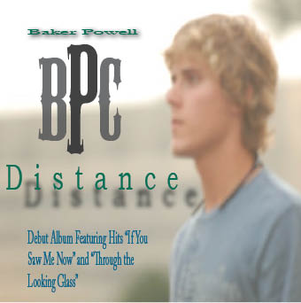
Baker Powell's Cd Debut Album Cover |
||
|---|---|---|
 |
|
|
 |
Karate Event Postcard |
|
|---|---|
I used vibrant colors and appetising graphics to suck the viewer in at first glance. The large font size of the the $5 allows for it to be one of the first things the viewer takes in. I used contrast to make each of the small phrases pop in their own ways, repitition to reiterate the sale, and proximity to fill the page with juicy graphics and really give the viewer a taste of the character of this restaurant. I aligned the images and text to create the feel of a wave coming in. |
 |
Atlantic Brewer's Logo |
|
|---|---|
I designed this logo to be eye-catching, attractive, and creative. I created the monogram to be a kind of mini logo within the larger logo. This message is easy to read for the intended audience because the font is much larer for the name and smaller for the less important details. I used three different fonts, used the oval and rounded rectangle commands to create my own mug, and used the text on a path command to create the wording in the handle of the mug. I also used different shades and colors to make the logo more appealing. In accordance with design principles, my logo has an appropriate amount of contrast created by the different colors and shades. I used repition by creating the monogram to compliment the title of the company. I also aligned the objects in the center of each of the different elements that they were placed in and used the space wisely create an equal proximity. |
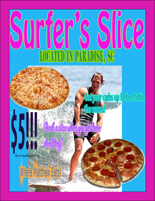
Surfer's Slice Pizza Place |
|
|---|---|
I used vibrant colors and appetising graphics to suck the viewer in at first glance. The large font size of the the $5 allows for it to be one of the first things the viewer takes in. I used contrast to make each of the small phrases pop in their own ways, repitition to reiterate the sale, and proximity to fill the page with juicy graphics and really give the viewer a taste of the character of this restaurant. I aligned the images and text to create the feel of a wave coming in. |
 |
|
 |
|---|---|
 |

|